Inna Avramenko
Portfolio website for brand photographer Inna Avramenko.
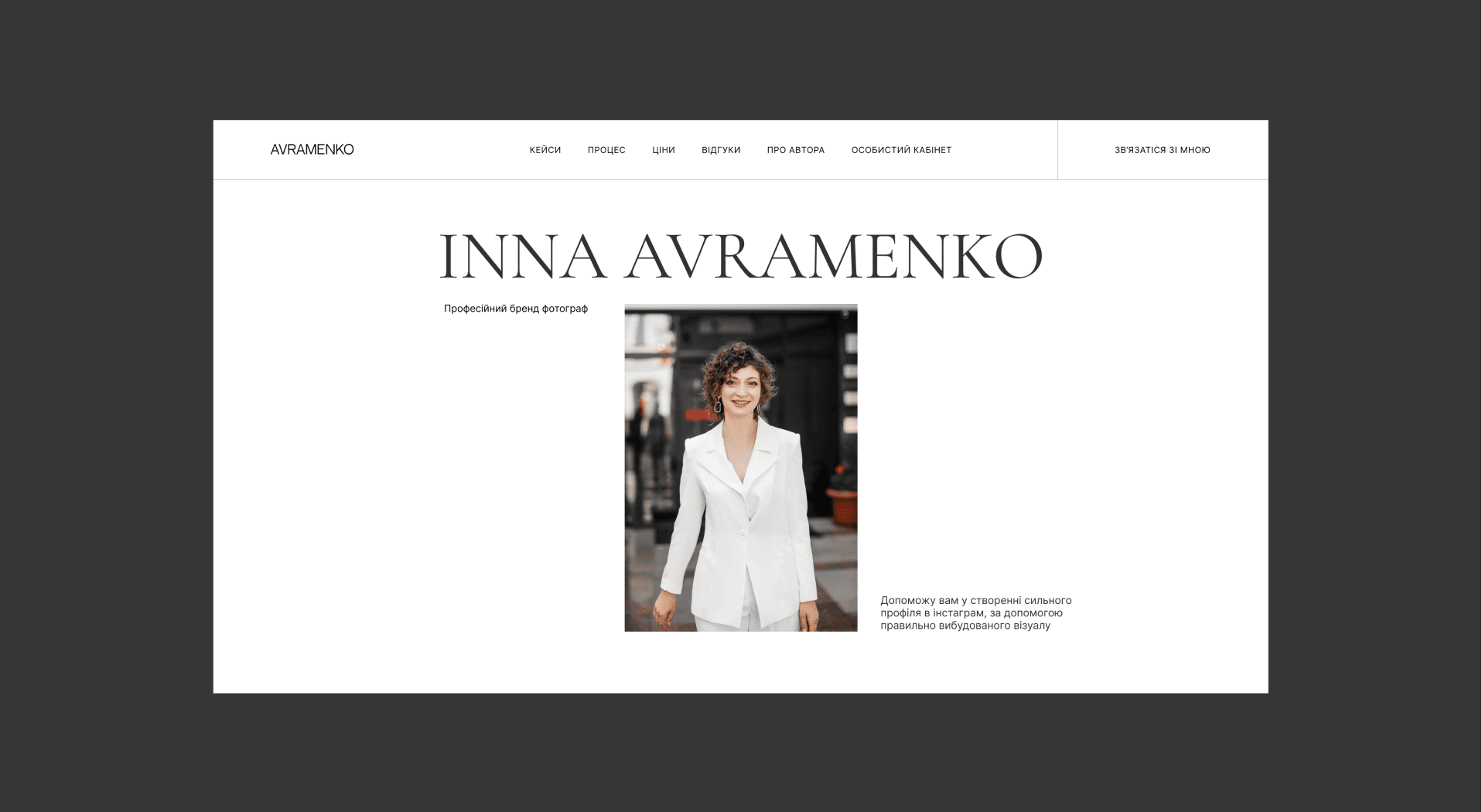
Inna helps experts and brands to express themselves and reveal their uniqueness with the help of photos and visuals.
A portfolio website was needed to tell in detail about the services, benefits and stages of work. And also in order to “highlight” the values of a specialist and show works and cases.
A portfolio website was needed to tell in detail about the services, benefits and stages of work. And also in order to “highlight” the values of a specialist and show works and cases.
date
awards
08.10.2021
visit website
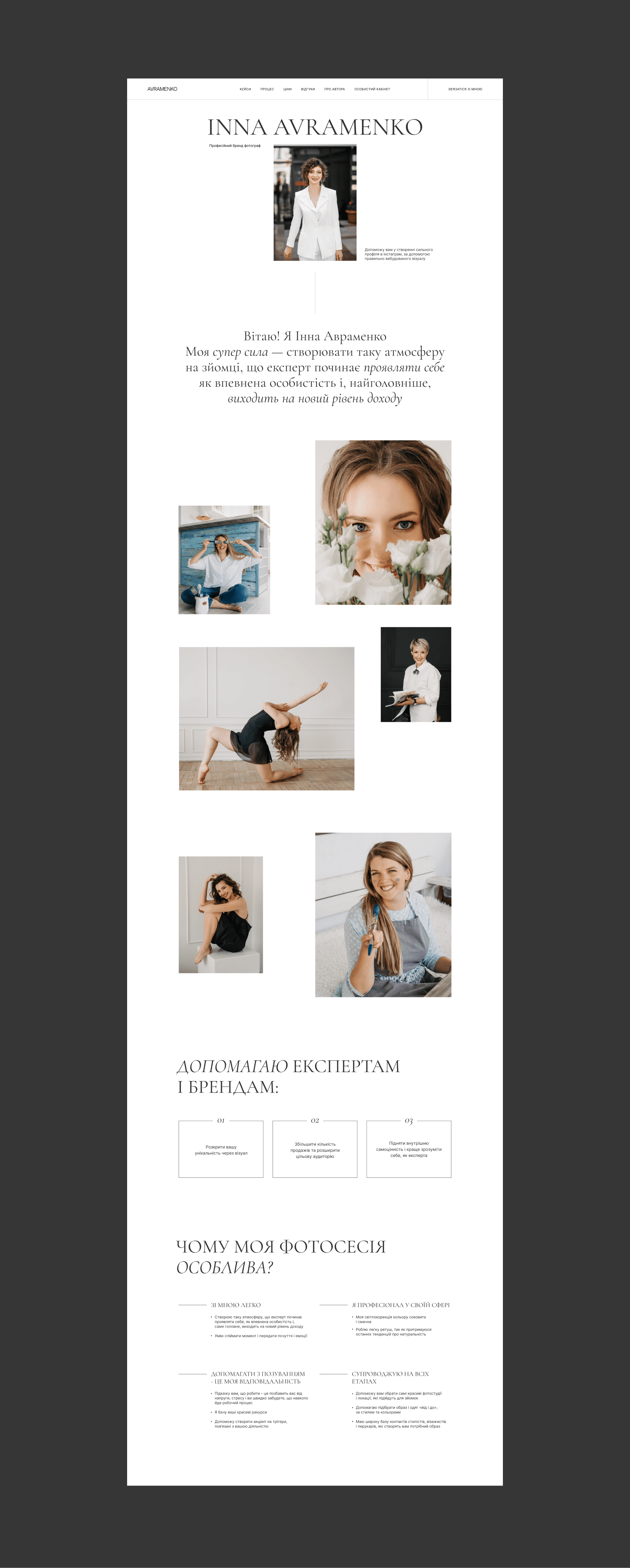
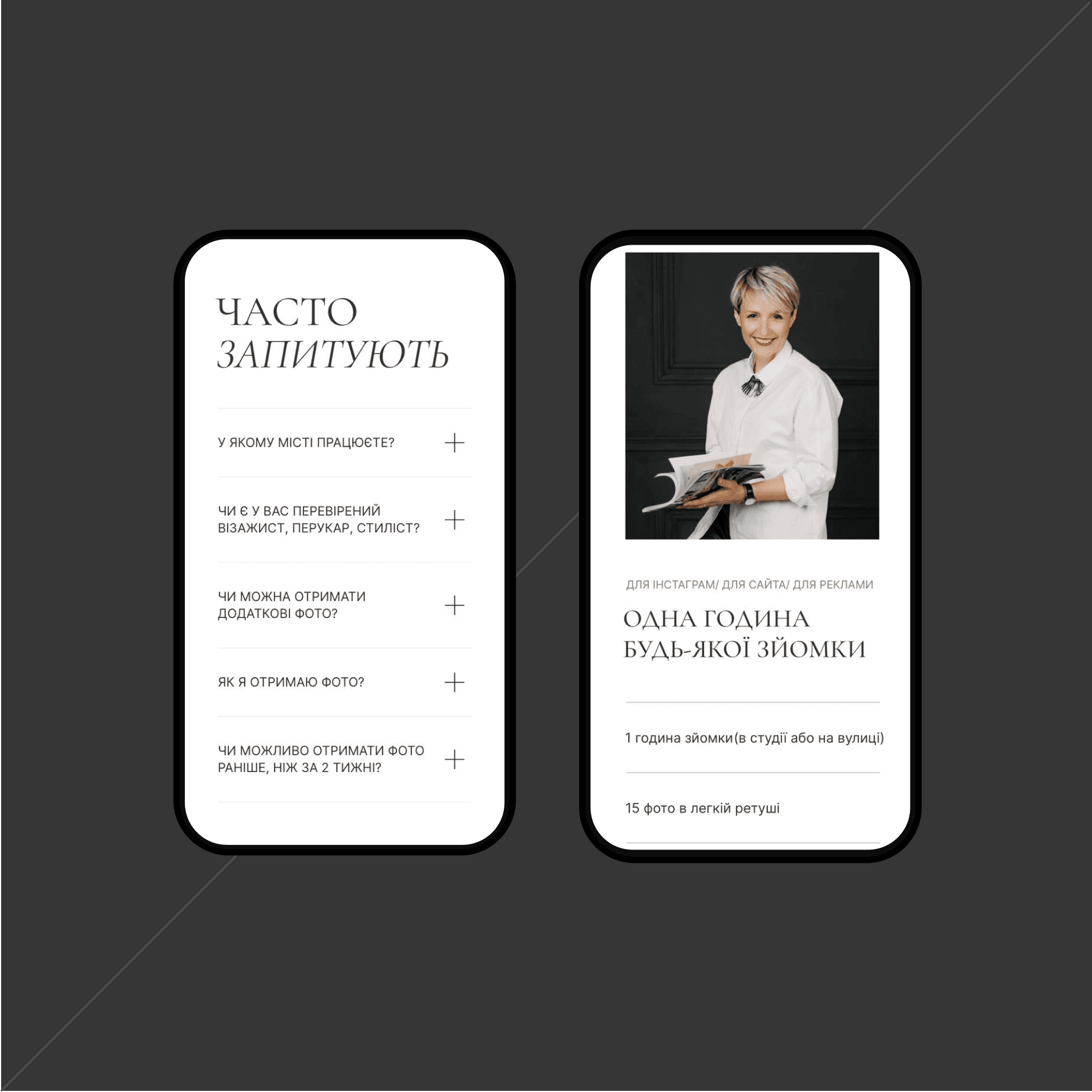
The text is divided into semantic blocks and arranged in such a way that as you read, most of the questions and objections that the client may have are revealed and removed.
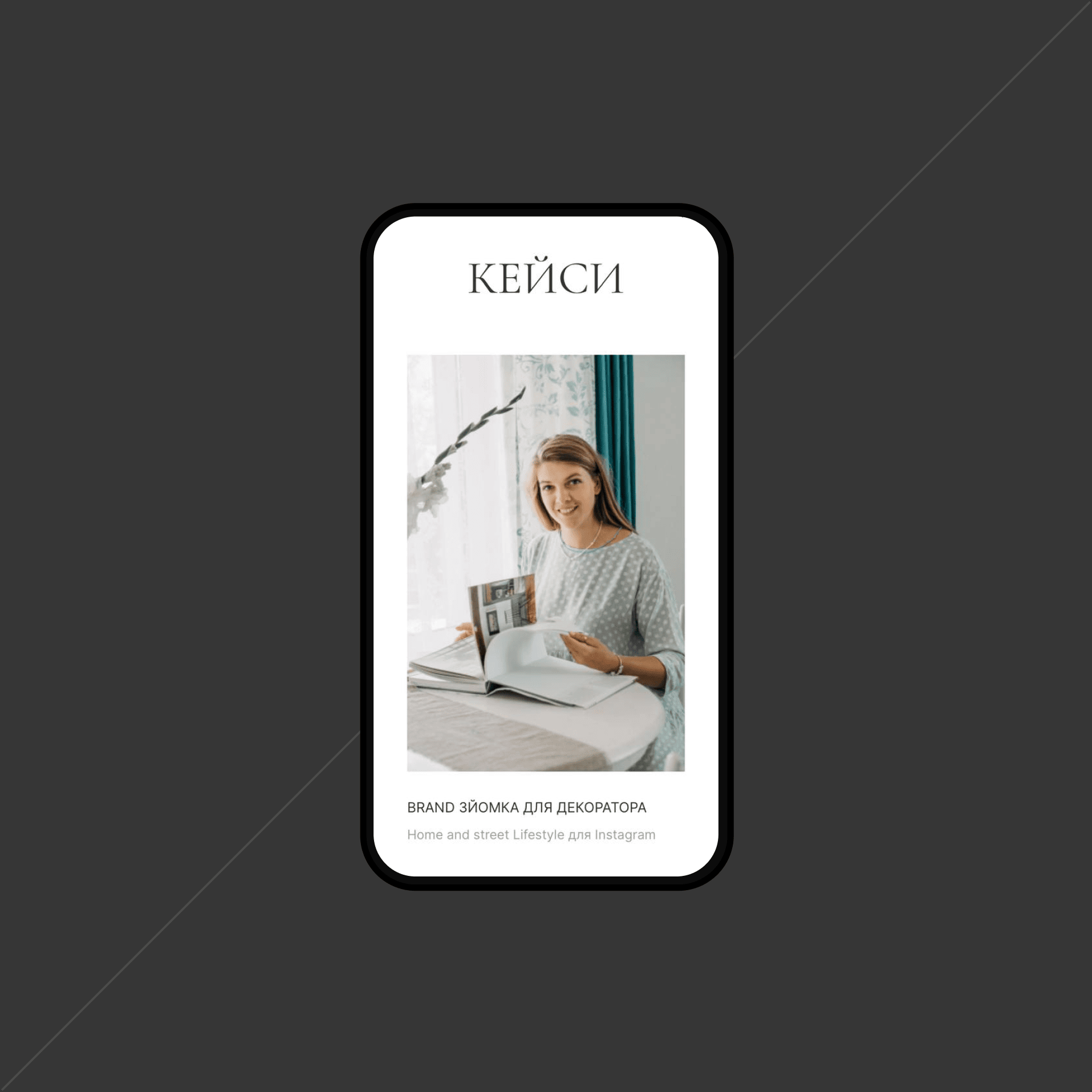
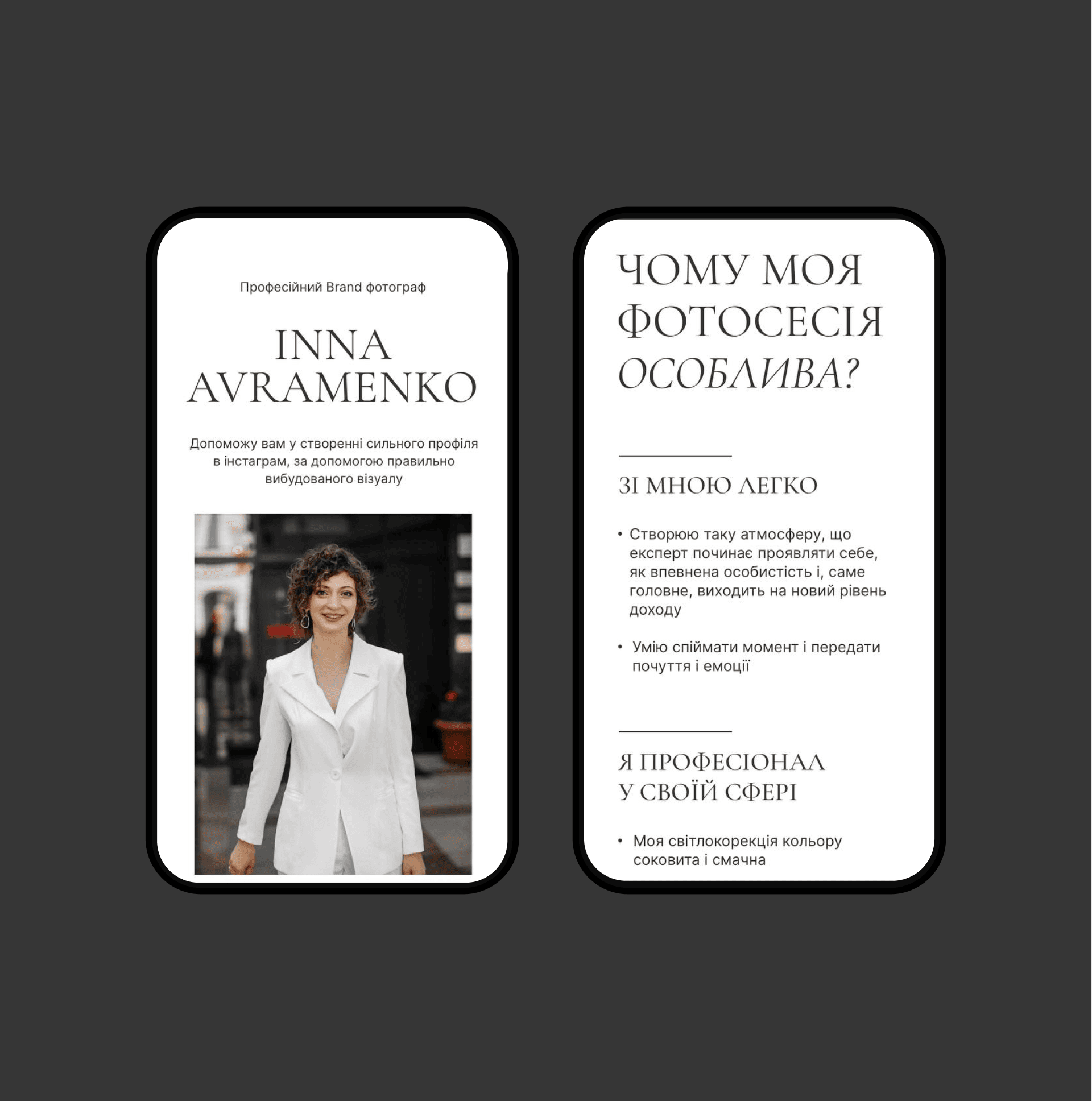
A white, clean background so that all the focus is on text and photos. Thin serif font for headings + neat font for body text.
Tables, lists and forms enliven the design and do not allow you to get bored, while light lines and touches emphasize aesthetics and elegance.
A white, clean background so that all the focus is on text and photos. Thin serif font for headings + neat font for body text.
Tables, lists and forms enliven the design and do not allow you to get bored, while light lines and touches emphasize aesthetics and elegance.

Everything went on a light wave, starting with the discussion of the idea itself and ending with the implementation on the site. Most of all I liked that Masha heard all the wishes and adjustments that I wanted to see on the site.
The most important thing is to meet and choose exactly the person with whom you will be comfortable working and you will look in the same direction. Masha has become such a professional for me.
Happy we met! Thanks for making my little dream come true!
The most important thing is to meet and choose exactly the person with whom you will be comfortable working and you will look in the same direction. Masha has become such a professional for me.
Happy we met! Thanks for making my little dream come true!
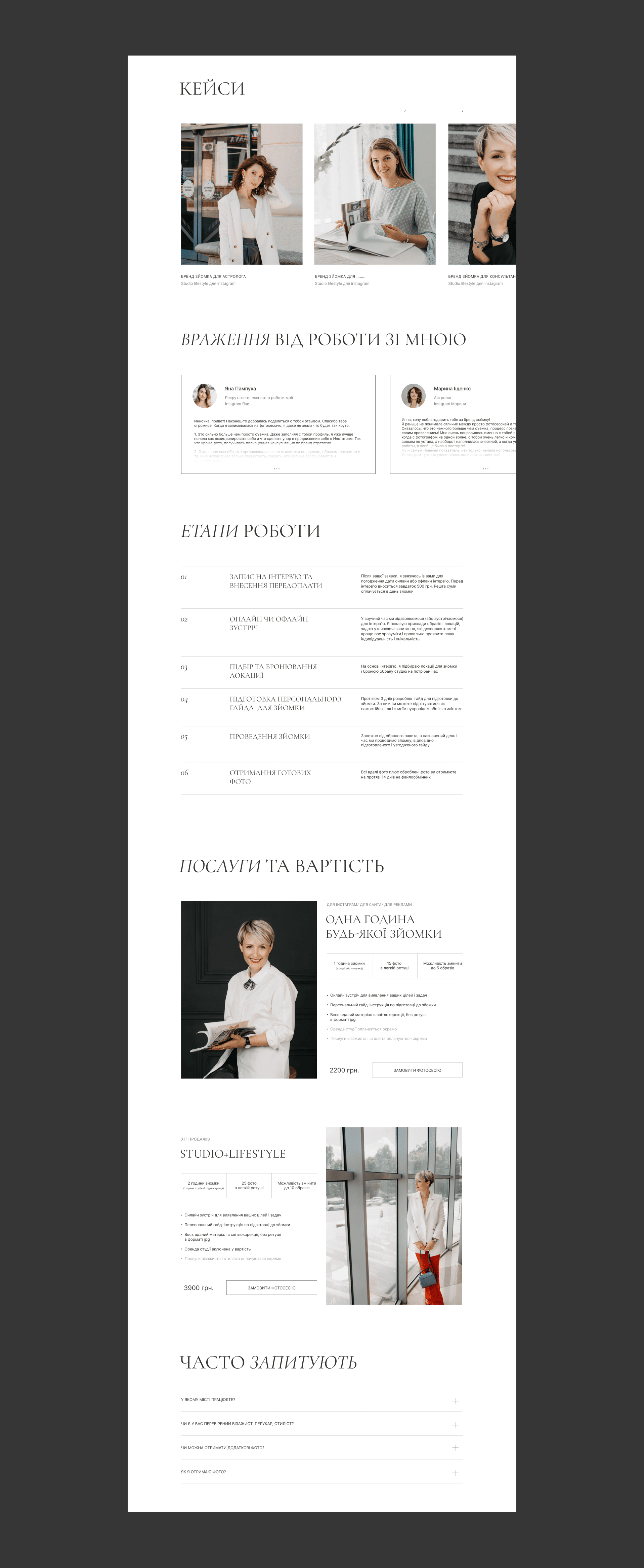
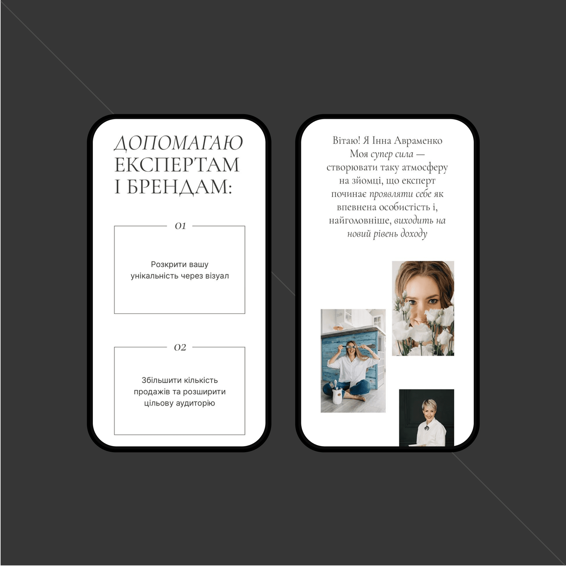
The result is an elegant, airy, stylish and minimalistic website. Thanks to a large amount of negative space and smooth animation, we managed to “highlight” the most important thing - photos.
And as a bonus, the site was included in the madeontilda collection.
And as a bonus, the site was included in the madeontilda collection.


