Shiseido
Design concept for Shiseido, the oldest cosmetics company
The reason why Shiseido remains less visible on beauty radars is due to its rich Japanese history. In Japan, it's considered bad manners to talk too much about yourself.
Therefore, Shiseido does not shout about himself, but rather “whispers”.
Therefore, Shiseido does not shout about himself, but rather “whispers”.
type
date
design concept
check on Behance
07.07.2022

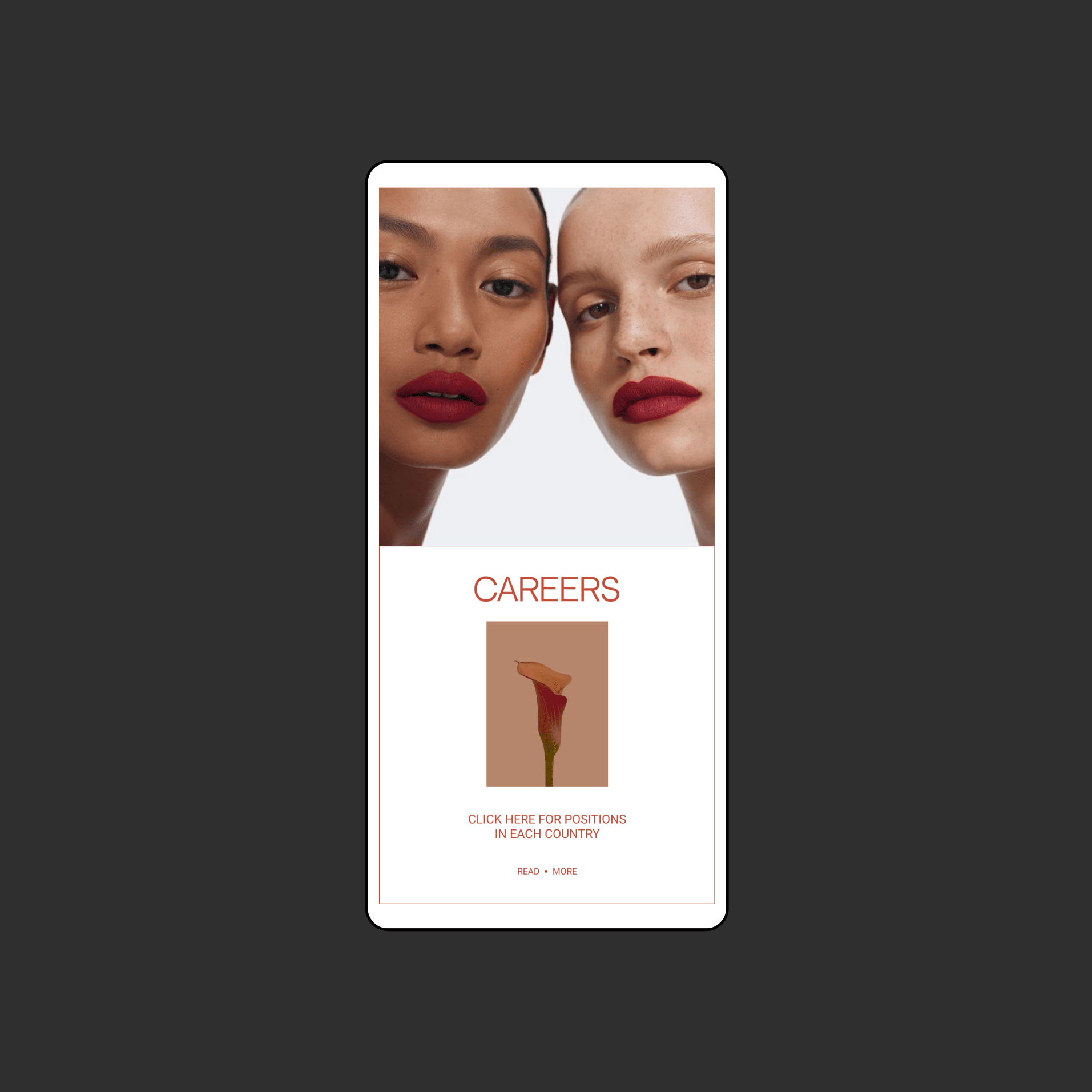
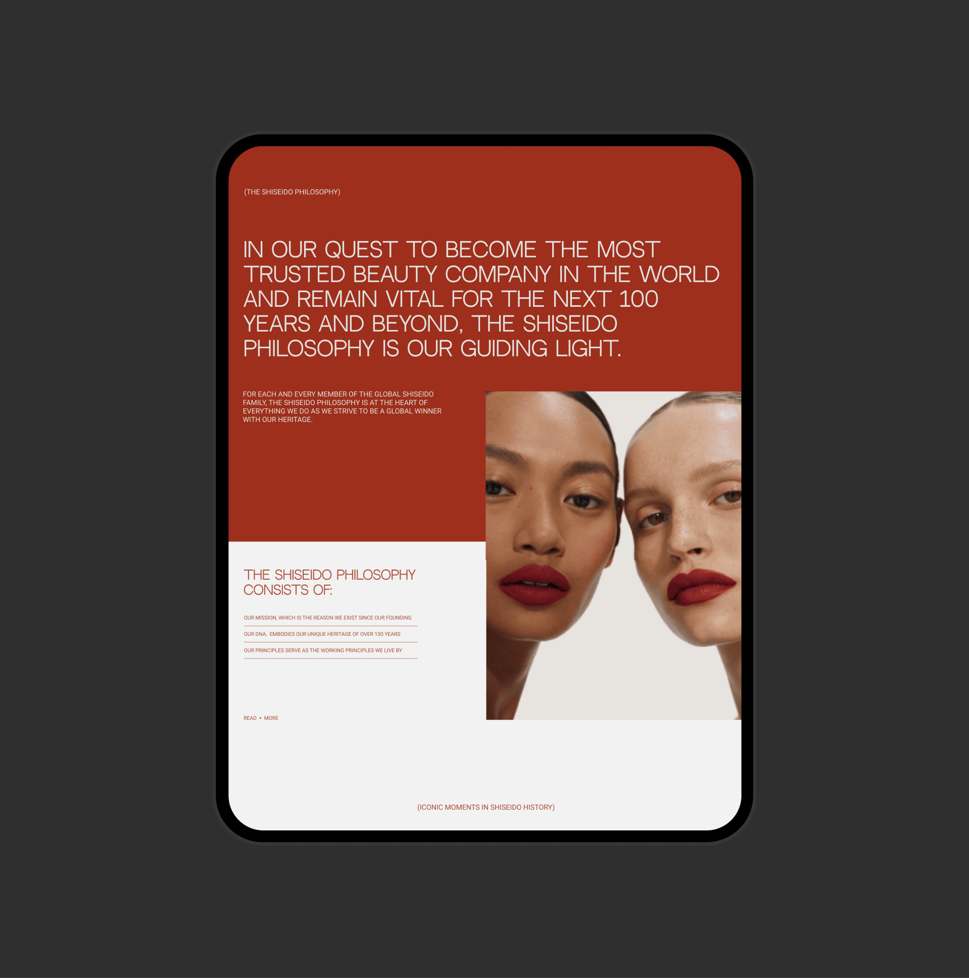
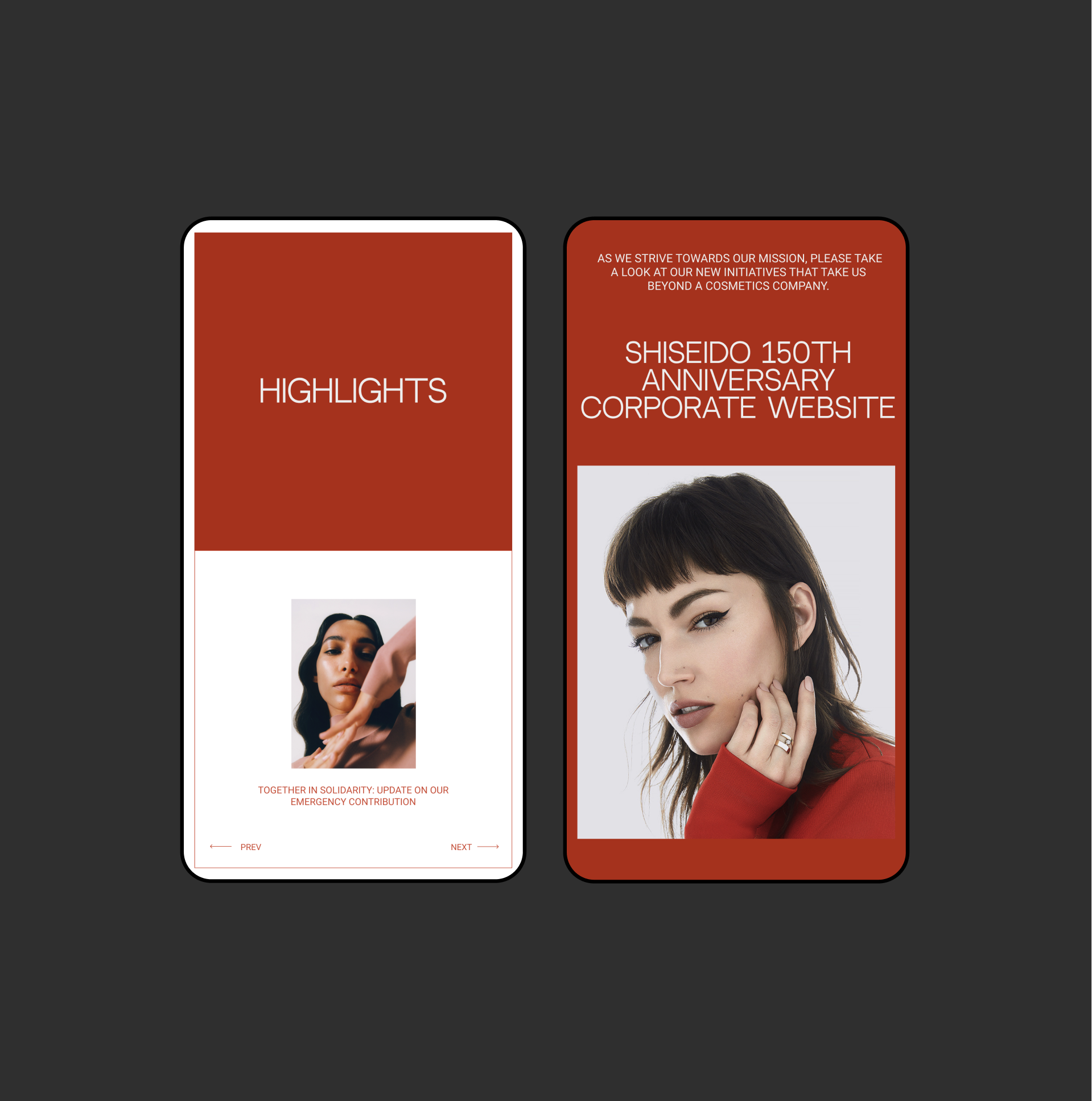
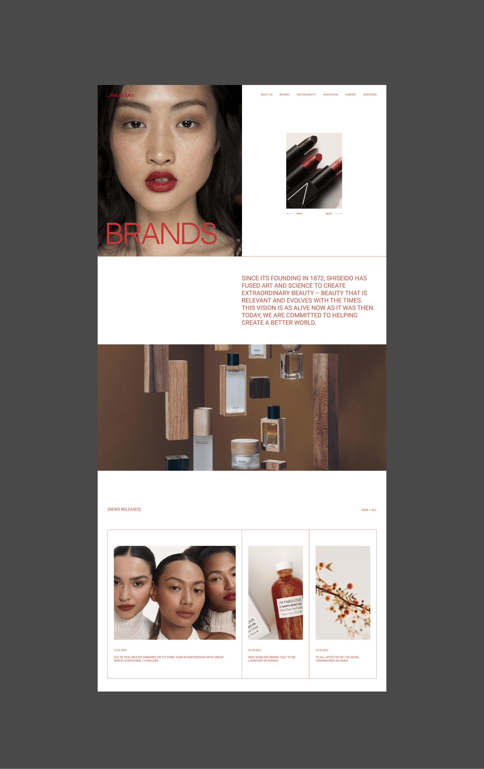
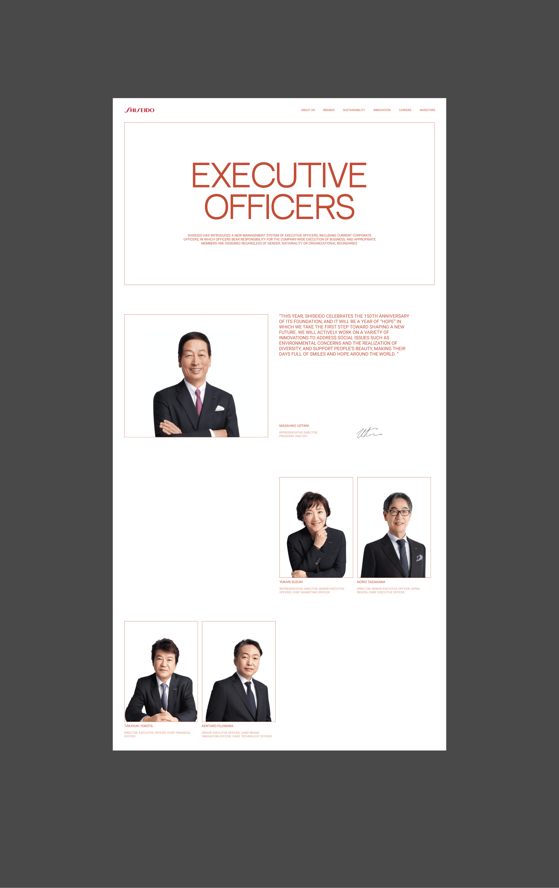
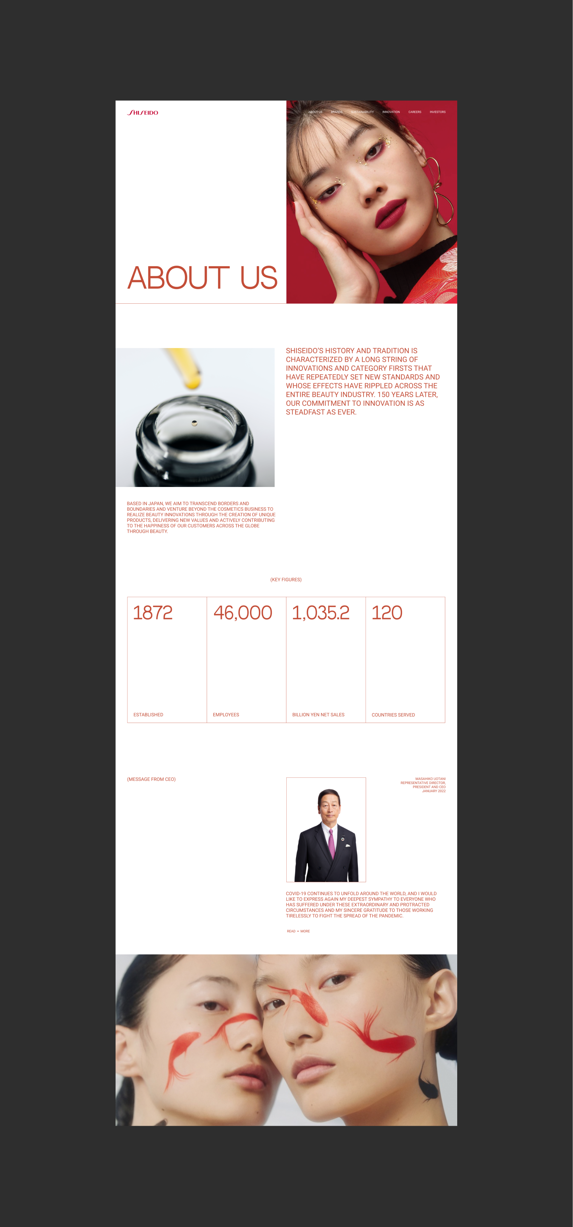
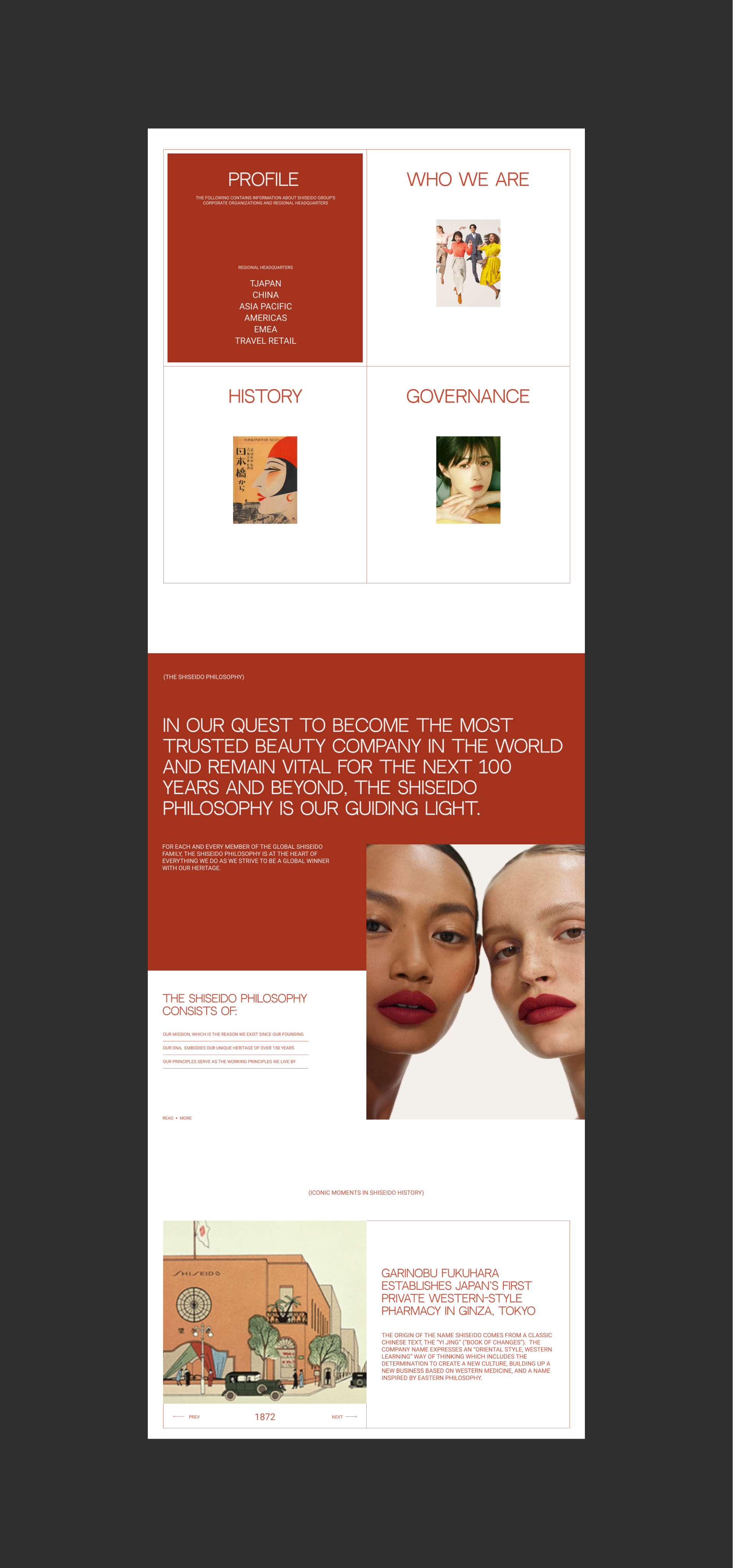
My goal was to make a more “loud”, showy and modern design. Using only one font and a simple two-column grid, it turned out to be a stylish and catchy concept.
The main focus is on typography and composition. I used the corporate colors, minimalism and added more juicy and daring photos.
The main focus is on typography and composition. I used the corporate colors, minimalism and added more juicy and daring photos.
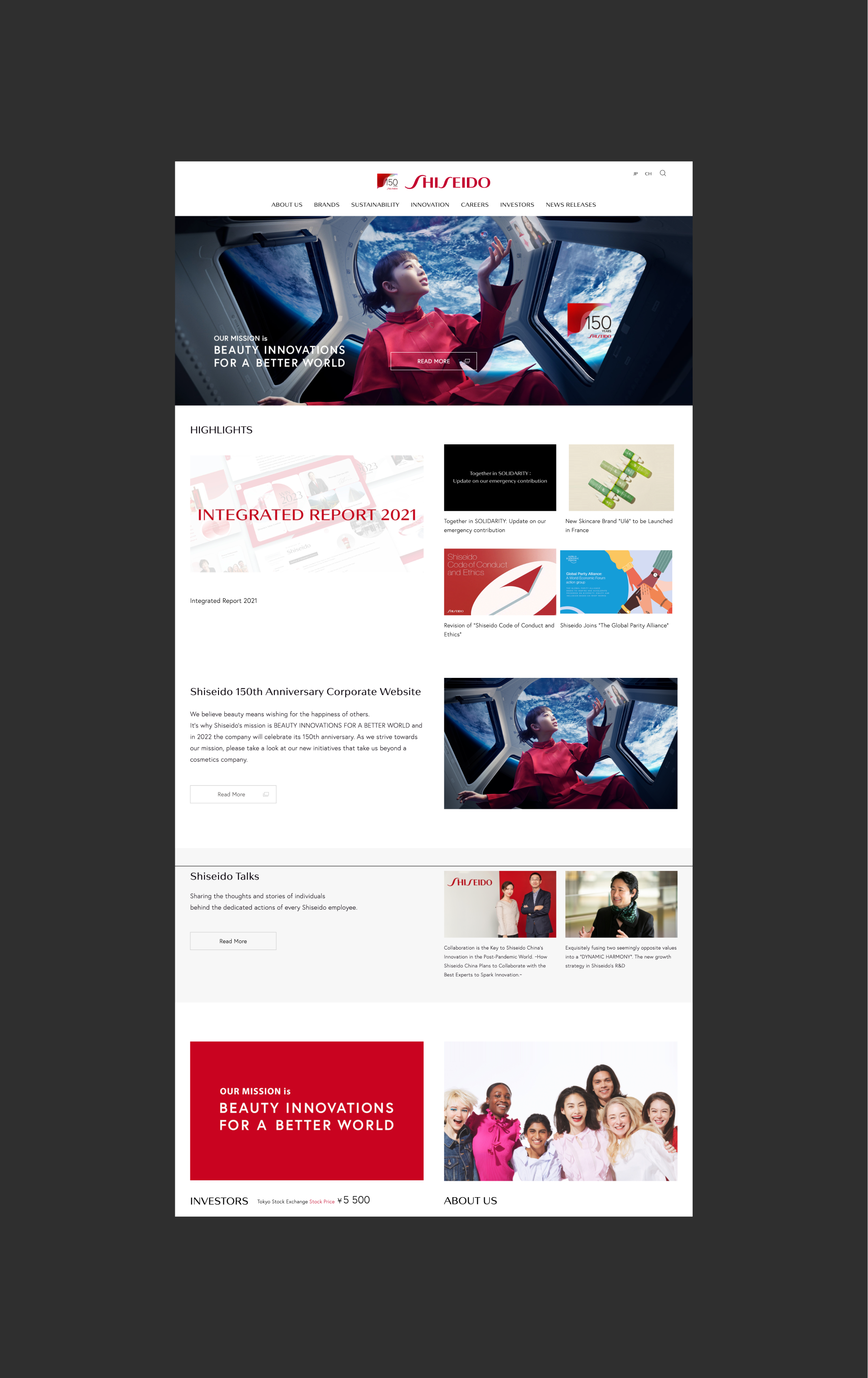
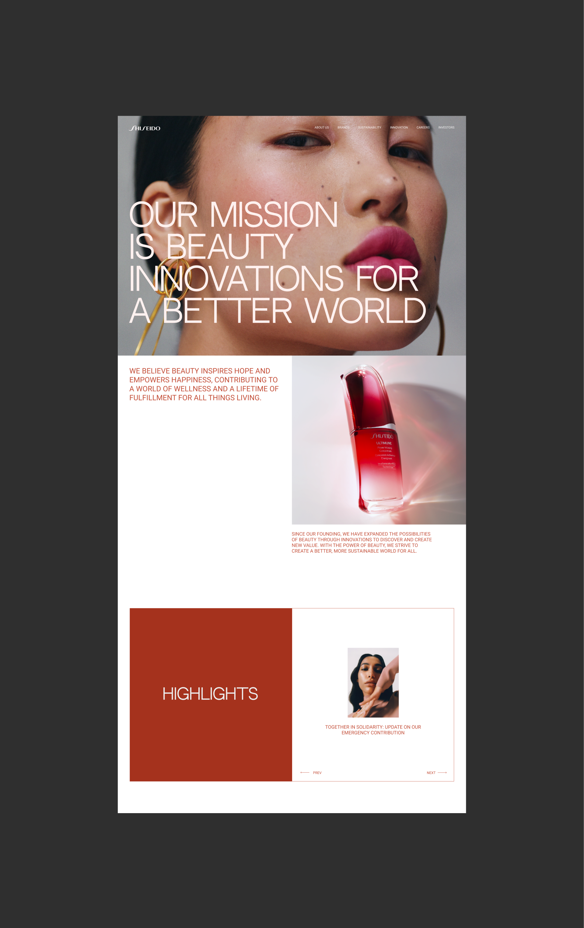
after redesign
before redesign
With this concept, I wanted to show how the design of the same site can look different and how perception and mood change.
Unfortunately, Shiseido did not contact me for a redesign of their website, but you can contact me and we will do something cool or even better)
Unfortunately, Shiseido did not contact me for a redesign of their website, but you can contact me and we will do something cool or even better)
