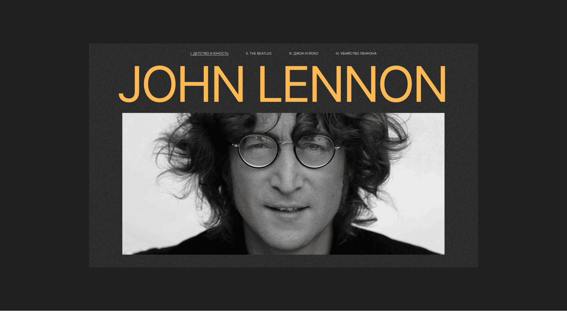
John Lennon
Longread about the life and work of John Lennon.
The designer's goal when he is working with a longreads is to hook and engage the reader so much that he wants to read to the end. If it turned out, the designer is сool, if not, you simply don't understand anything.
I probably got it - the site received three awards :)
I probably got it - the site received three awards :)
date
awards
08.10.2021
visit website
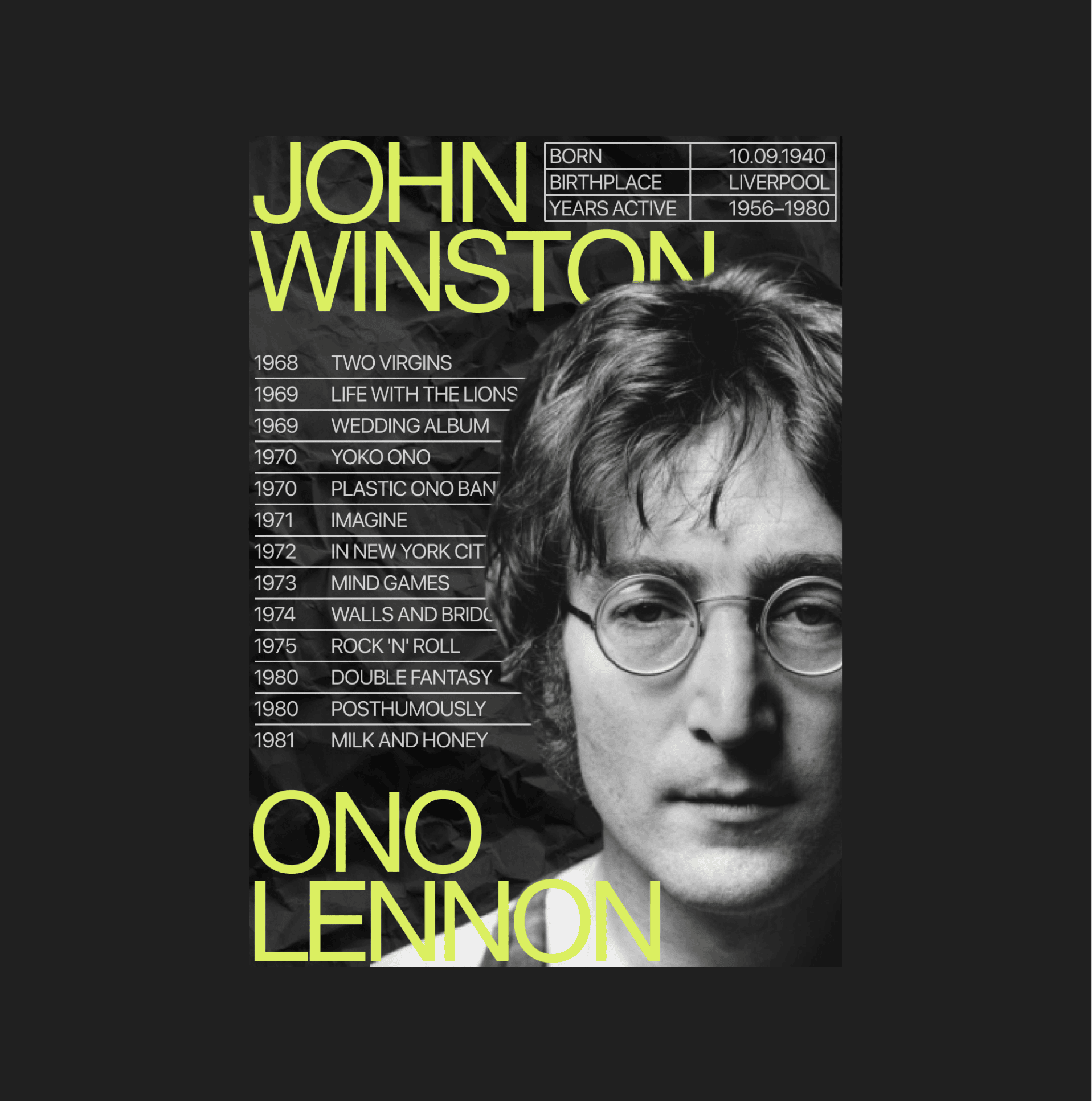
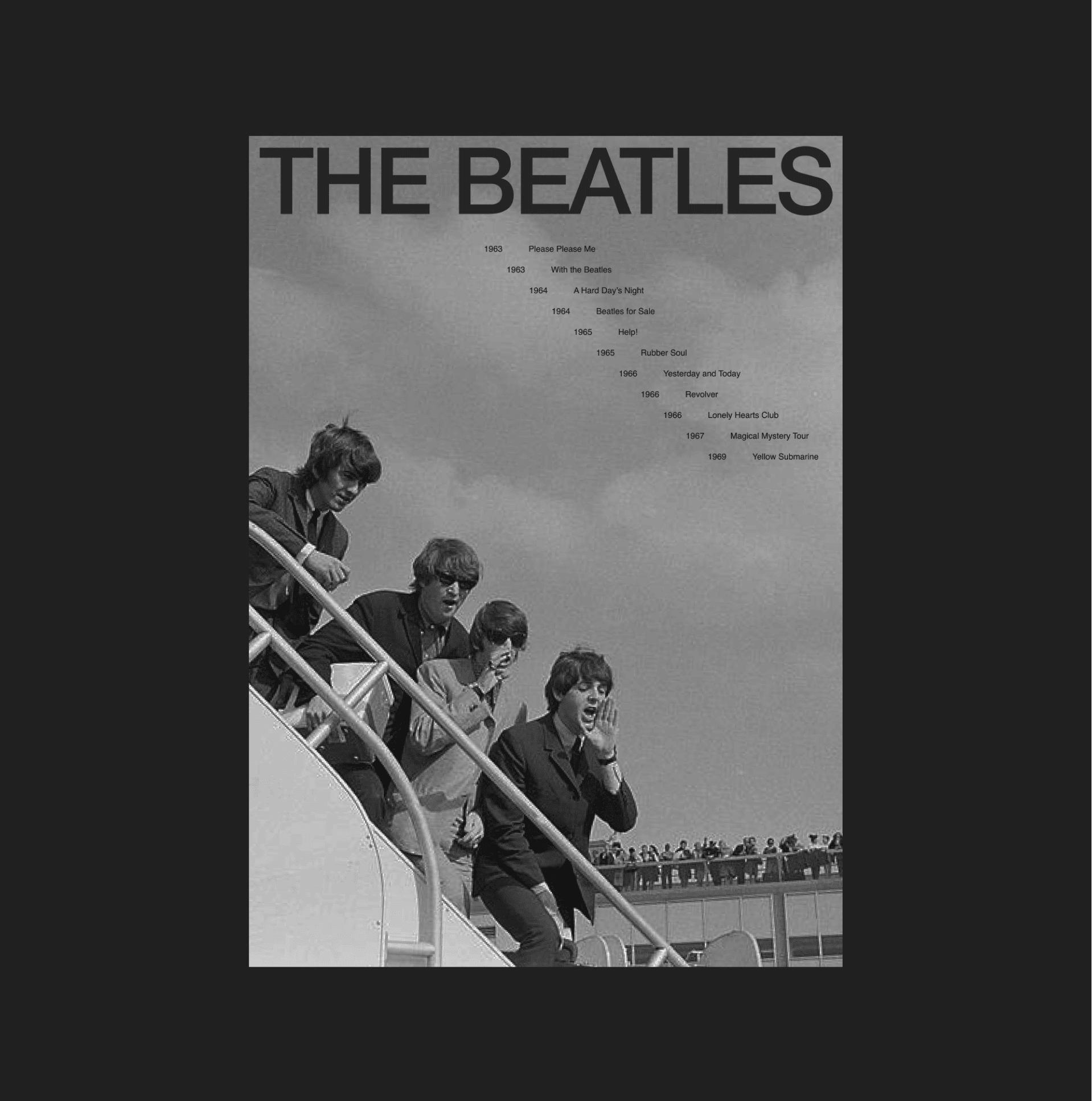
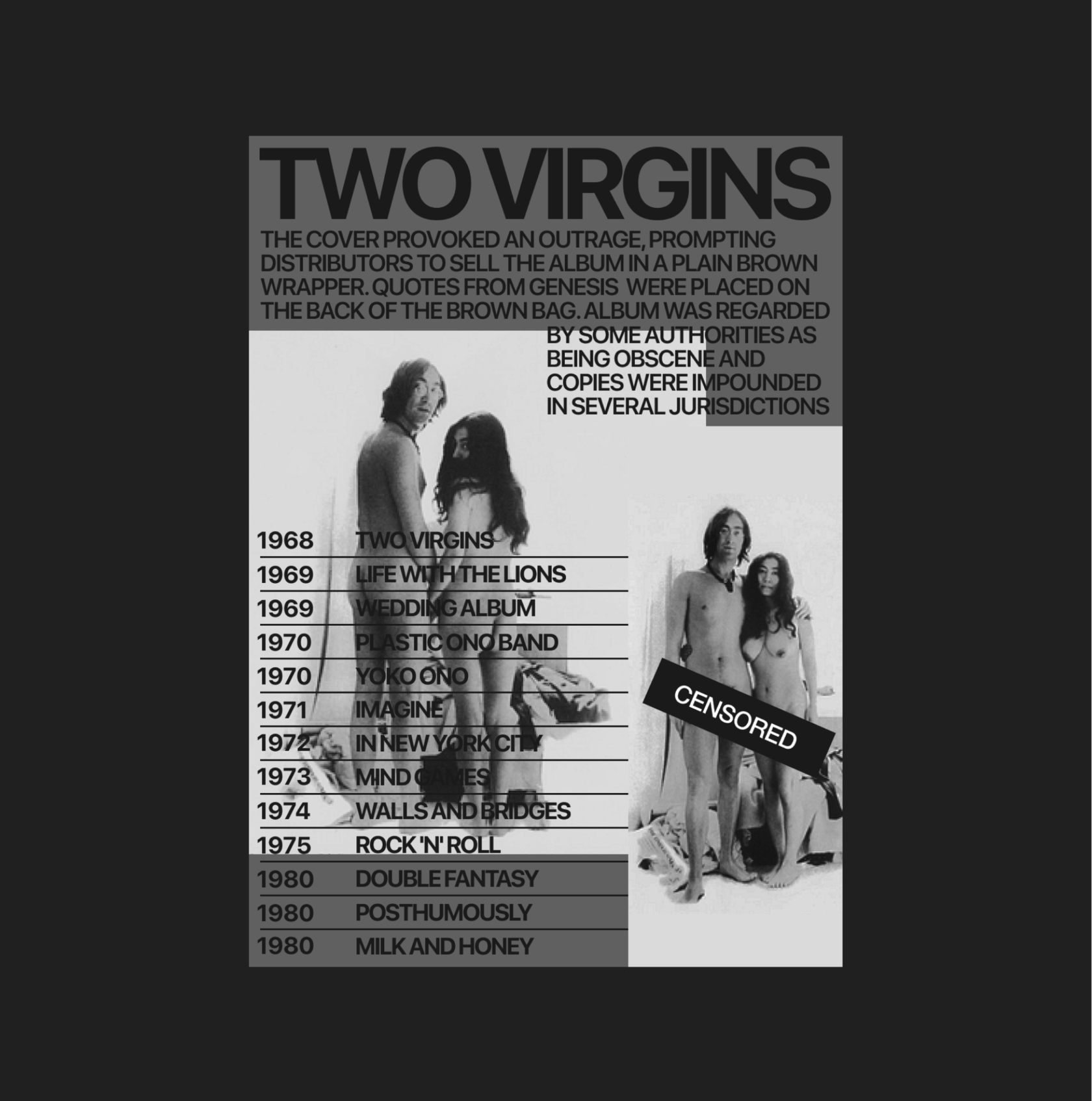
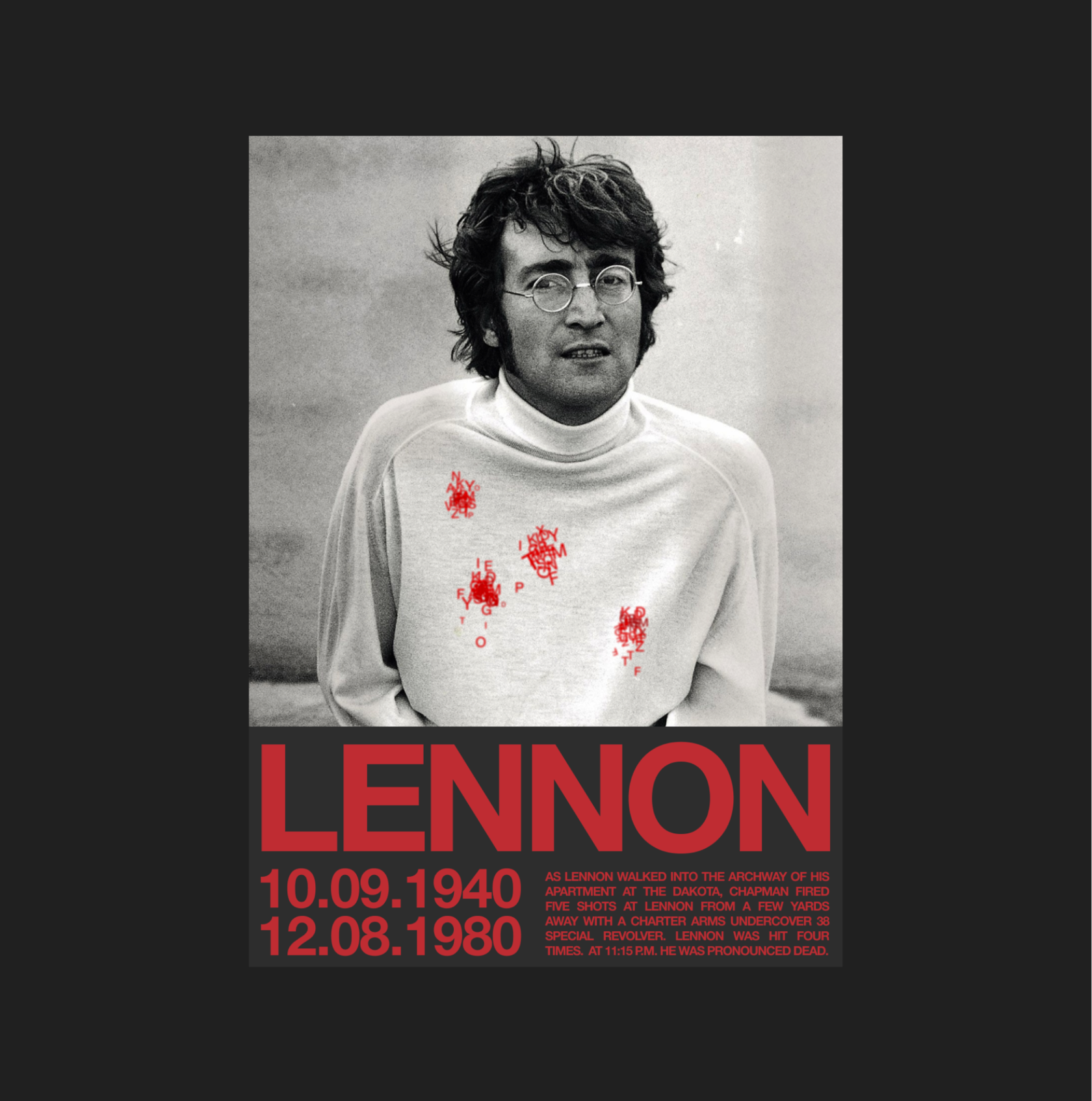
Also, within the framework of the theme, I made several posters in different styles.
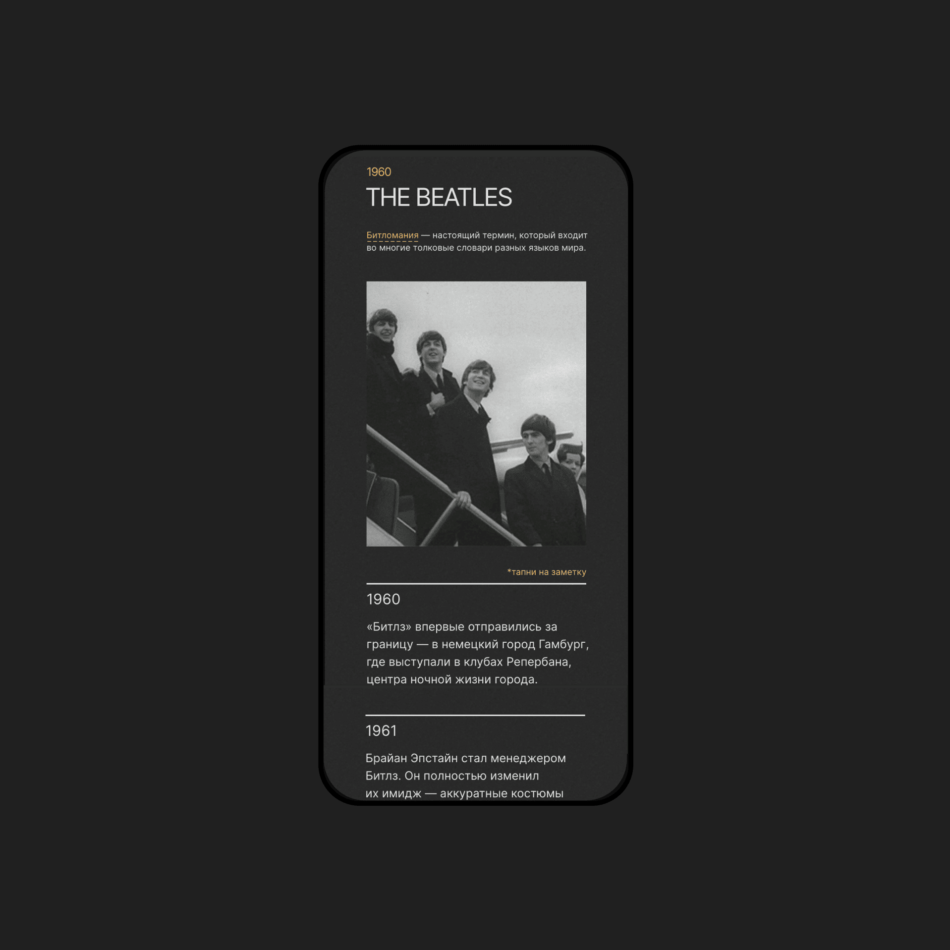
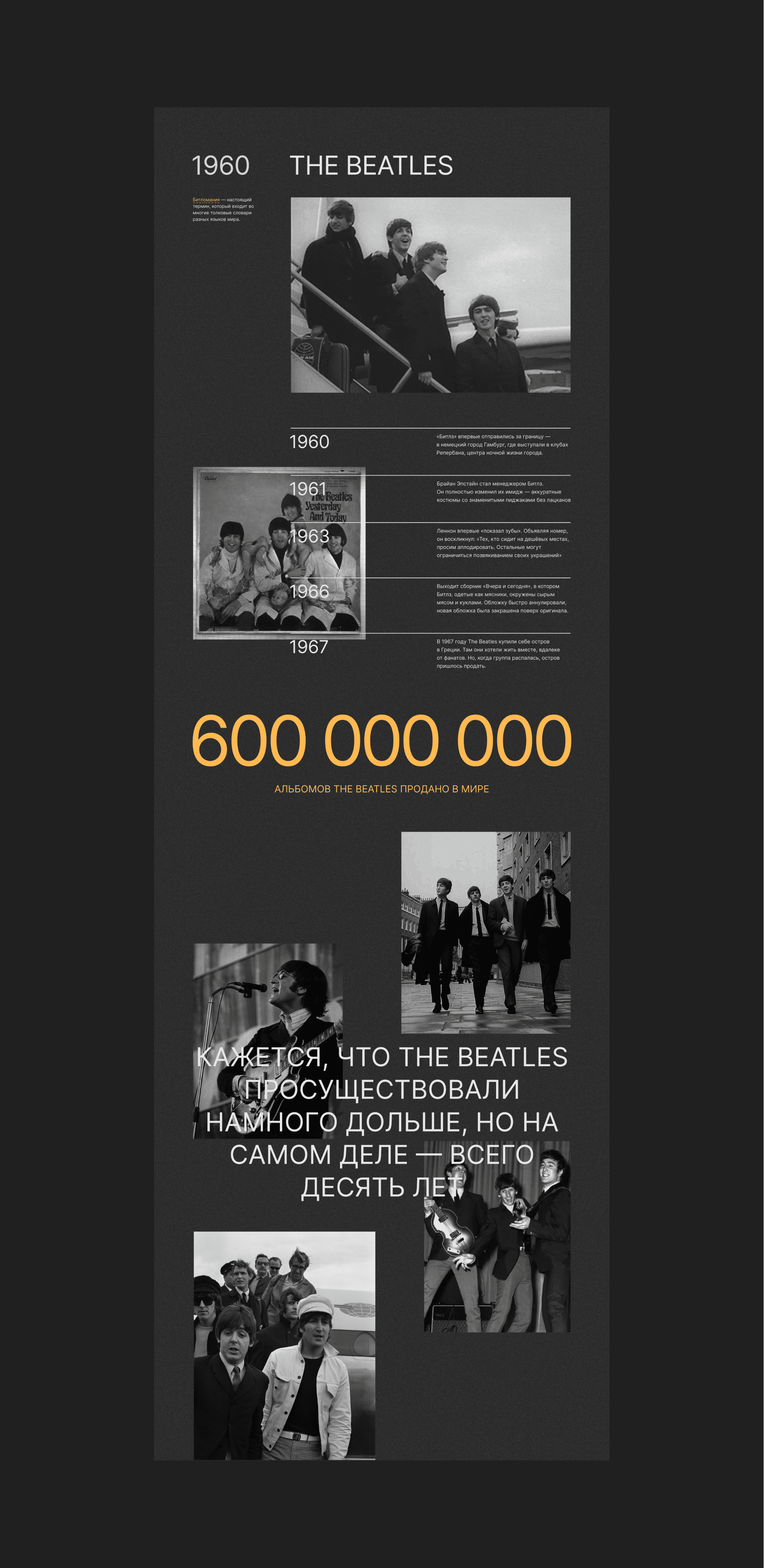
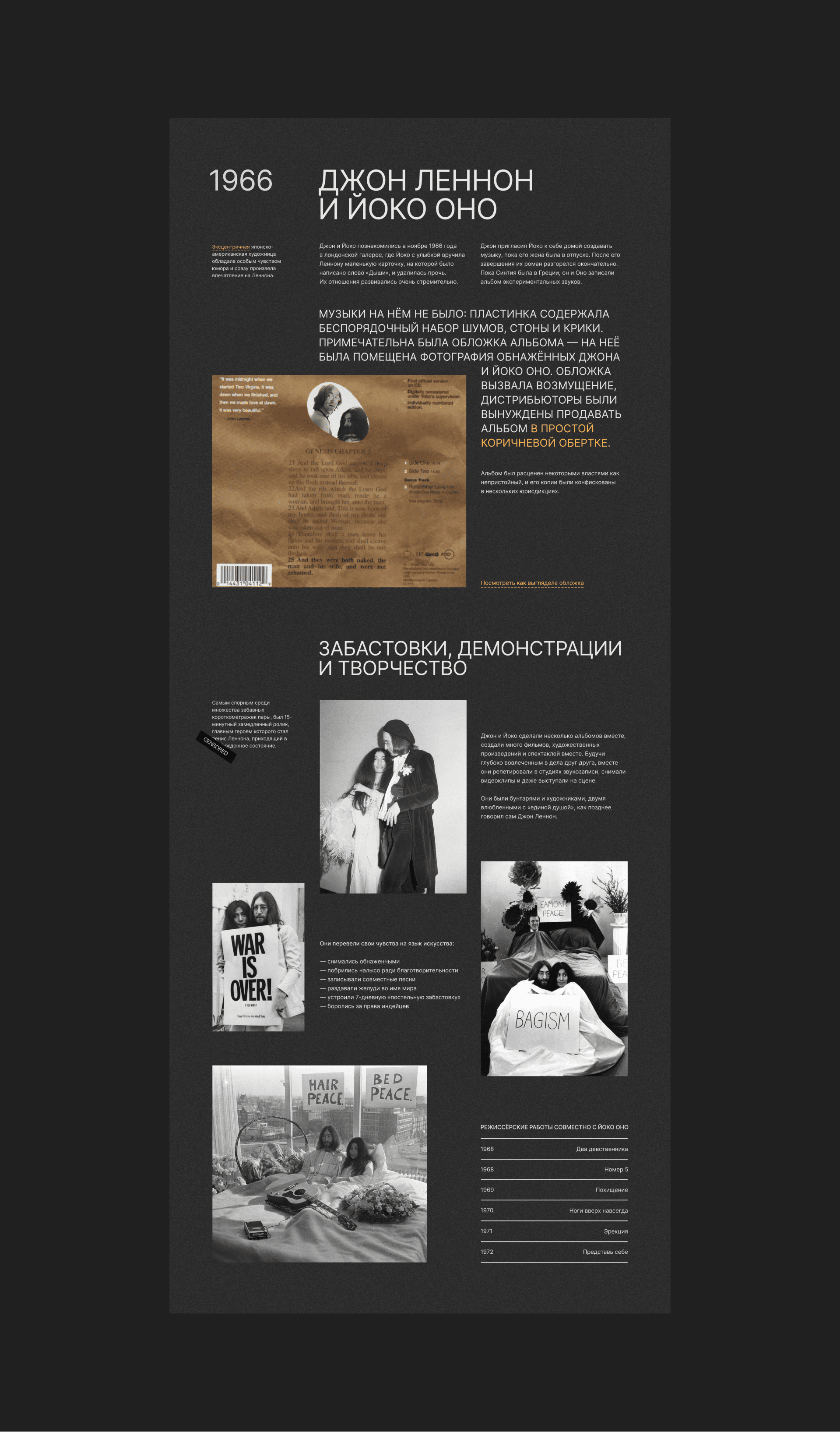
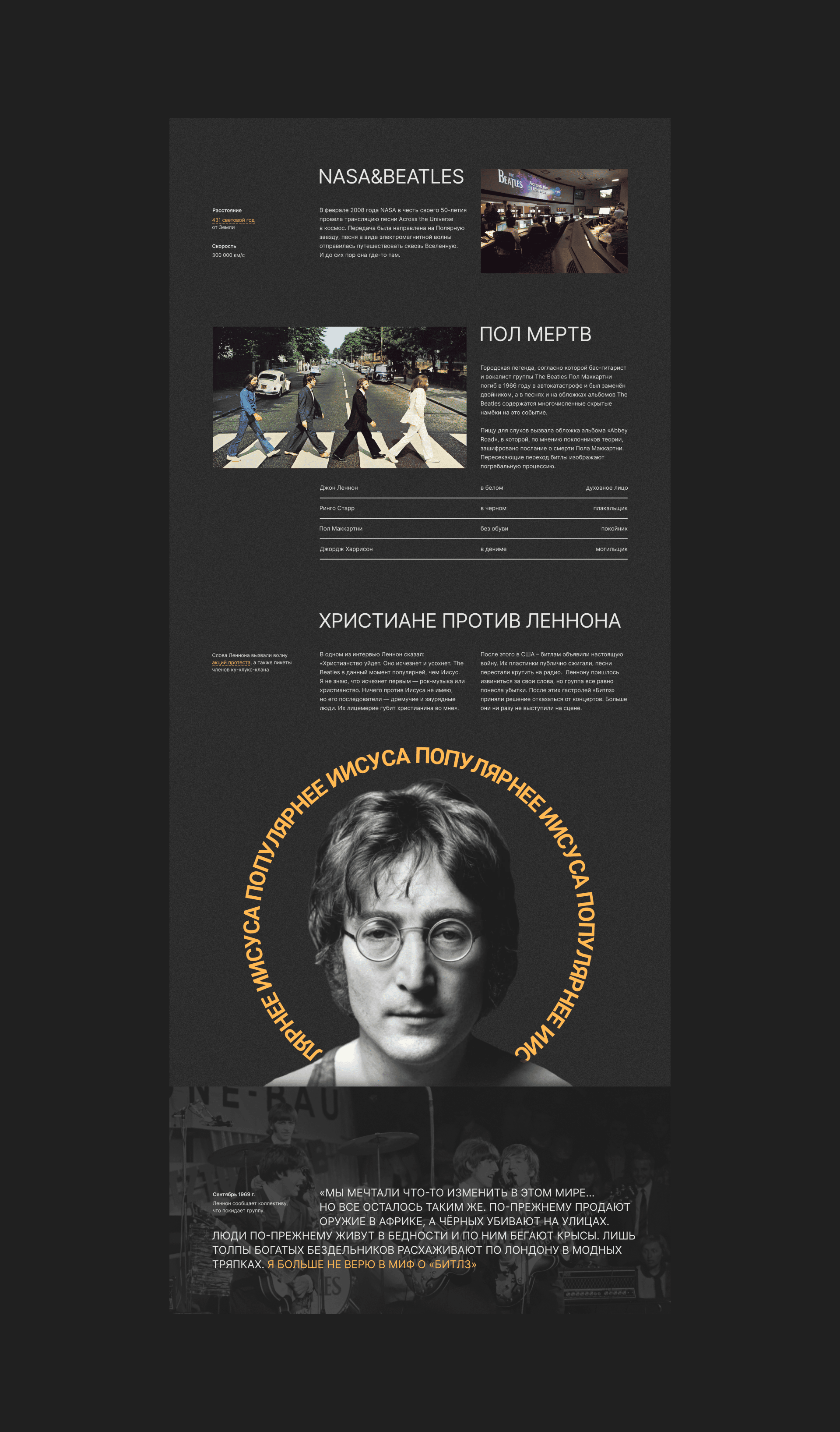
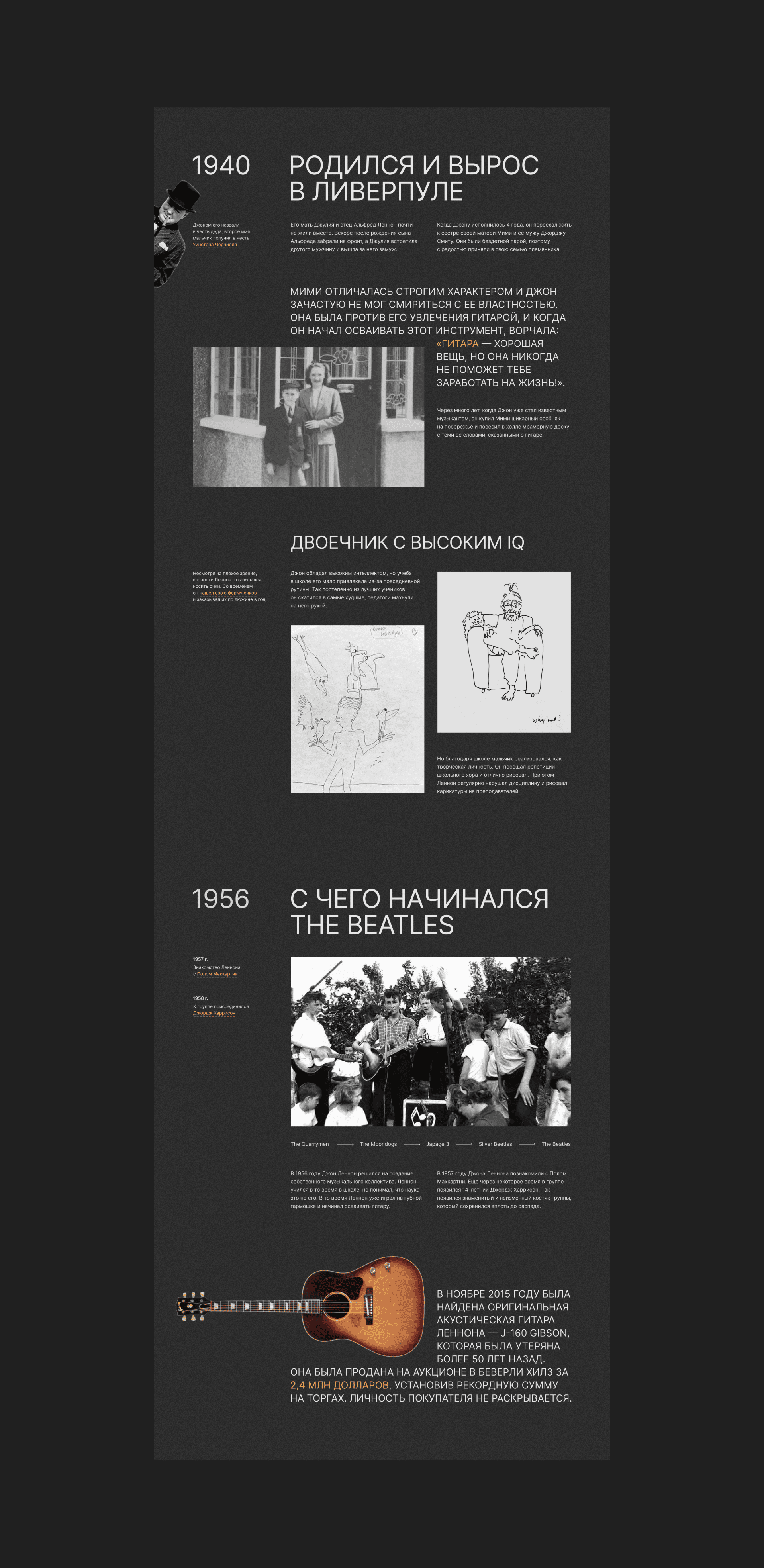
The main difficulty when working on a project is to work out and arrange a huge amount of text, photos, materials so that it is easily perceived.
What was done to solve this problem:
1. A sheet of text is divided into semantic blocks
2. Non-standard layout
3. The text is divided into elements: tables, lists, quotes, marginalia, facts
4. Clear font hierarchy
What was done to solve this problem:
1. A sheet of text is divided into semantic blocks
2. Non-standard layout
3. The text is divided into elements: tables, lists, quotes, marginalia, facts
4. Clear font hierarchy
Stylistic solutions:
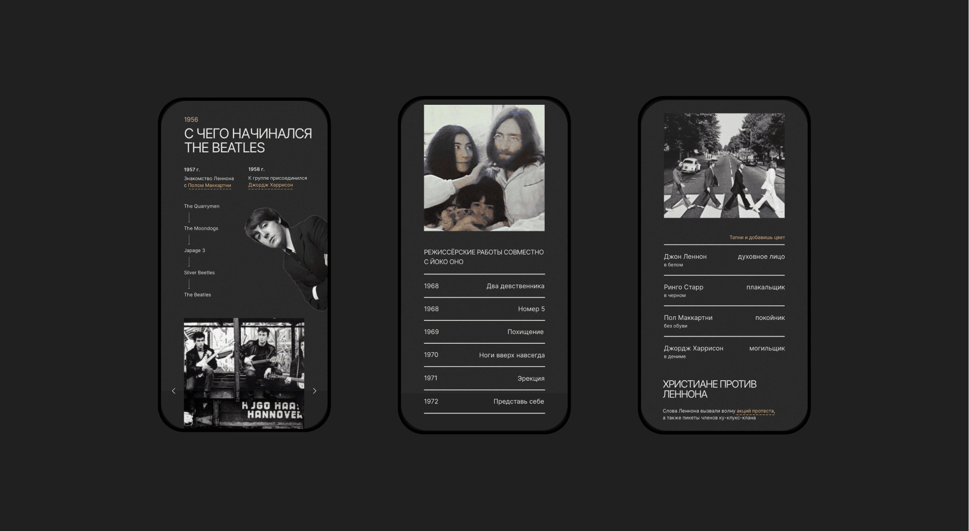
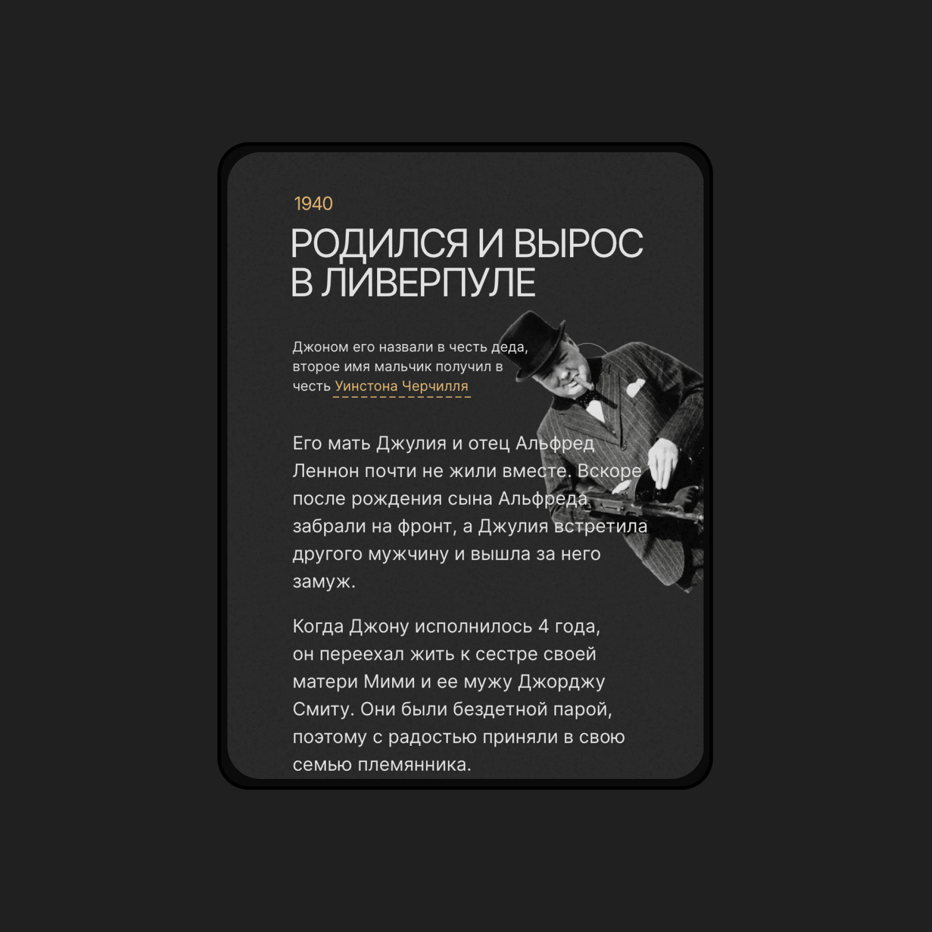
- Interactivity - many elements of the site react to user actions
- GIFs add liveliness and grab attention
- Dark background with “noise” to immerse in the era and add atmosphere
- Lots of photos, graphic elements and videos - images are perceived better than text
- Yellow for accents
- Unobtrusive animation brings the site to life
